

Use Chrome DevTools' Device Mode to build mobile-first, fully responsive websites. Learn how to use it to simulate a wide range of devices and their capabilities.
In a nutshell
- Emulate your site across different screen sizes and resolutions, including Retina displays.
- Responsively design by visualizing and inspecting CSS media queries.
- Evaluate your site's load performance with the Network Conditions drawer, without affecting traffic to other tabs.
- Accurately simulate device input for touch events, geolocation, and device orientation
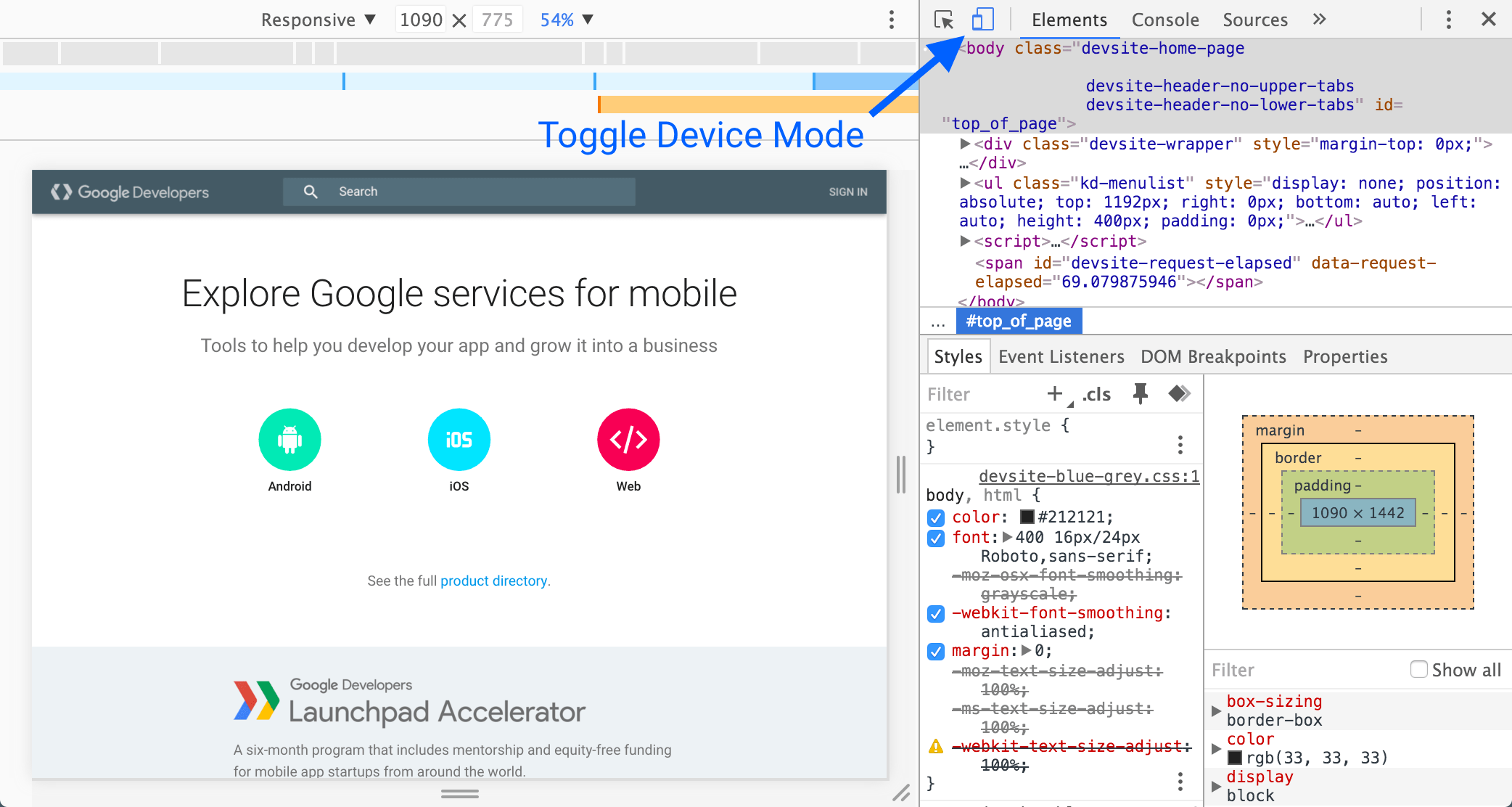
Toggle Device Mode
Toggle the Device Mode button to turn Device Mode on or off.
When Device Mode is on, the icon is blue
( ).
).
When it's off, the icon is grey
( ).
).
Device Mode is enabled by default.
You can also toggle Device Mode by pressing Command+Shift+M (Mac) or Ctrl+Shift+M (Windows, Linux). To use this shortcut your mouse needs to be focused on your DevTools window. If it's focused on your viewport, you'll trigger Chrome's switch user shortcut.